





Palette
Brand colors and logo
Harmony logo colors
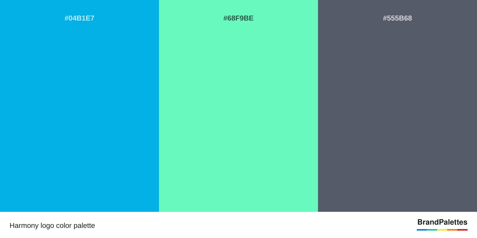
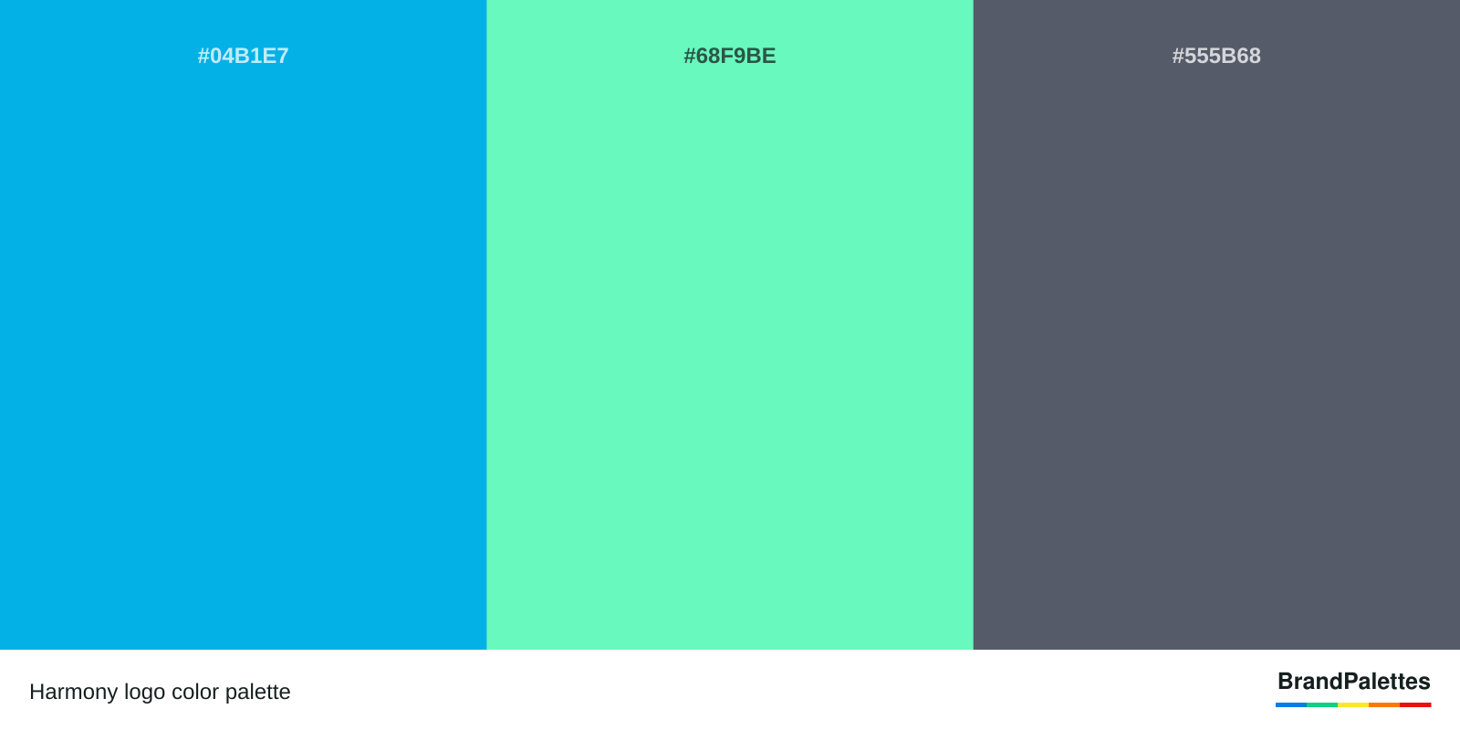
The Harmony logo palette has 3 colors: Blue (#04B1E7), Light Green (#68F9BE) and Gray (#555B68). Copy the complete palette in HEX, RGB, CMYK and Pantone formats.
- Brand
- Harmony
- Industry
- Finance & insurance
- Palette
- 3 colors
- Palette since
- 2018
Complete reference
Harmony color codes
Click any value to copy it instantly.
Blue
#04B1E7- HEX
- RGB
- CMYK
- Pantone
Light Green
#68F9BE- HEX
- RGB
- CMYK
- Pantone
Gray
#555B68- HEX
- RGB
- CMYK
- Pantone
All formats
Harmony color codes at a glance
| Color | HEX | RGB | CMYK | Pantone |
|---|---|---|---|---|
| Blue | #04B1E7 | 4, 177, 231 | 71, 10, 0, 0 | PMS 298 C |
| Light Green | #68F9BE | 104, 249, 190 | 47, 0, 41, 0 | PMS 353 C |
| Gray | #555B68 | 85, 91, 104 | 69, 58, 44, 22 | PMS 431 C |
Palette image
Download the Harmony color palette
High-resolution PNG and JPG files.
Harmony logo color palette
1600 × 800 pxQuick answers
Harmony logo questions
What is the Harmony color palette?
The official colors of Harmony are blue, light green, and gray. Harmony logo colors represent competence, growth, and balance. Harmony color palette has been the same since 2018. Harmony color scheme can be used for design projects and purposes. Harmony color codes and scheme for Pantone, HTML, HEX, RGB, and CMYK can be found below.
What are the Logo Colors of Harmony?
Harmony logo has blue, light green,and gray colors and features two pill-shaped objects standing next to each other, connected by a wavy line to form an image that resembles the letter "H". The Harmony logo meaning symbolizes how the brand positions itself as a fast and secure blockchain network where developers can easily create apps.
Harmony Logo Fonts
The Harmony logo font is a custom Harmony typeface. The custom Harmony font is used for the wordmark, branding, and advertising.
What Is the Meaning of the Harmony logo?
Harmony logo meaning is the unparalleled security and decentralization that the blockchain-based platform provides. Harmony logo colors symbolize competence, growth, and balance. Blue color from the Harmony logo represents competence. Light green color from Harmony logo symbolizes growth. Gray color from Harmony logo symbolizes balance.
Harmony Logo Story
Harmony logo has been created by the Harmony company. Harmony has created Harmony logo and chosen blue, light green, and gray as the Harmony brand color palette because they create a harmonious blend, which fits the company's name and its goal to assist billions of people worldwide through open consensus methods.
Harmony Logo Colors Confirmation
Harmony logo colors are confirmed by the Harmony company. Blue, light green, and gray colors for the Harmony brand logo can be confirmed by visiting Harmony official website.
Keep exploring
Related brand palettes
Tether
3 colors

Hulu
1 color

John Deere
3 colors

Spotify
1 color

2 colors
